Khazana
A UX Case Study
A Table Reservation App for a Restaurant
Created for the Google UX Design Course


Problem Statement
Problem Statement
Solution Statement
Solution Statement
Users find it hard to reserve a table at the restaurant due to either unavailability of the restaurant's number, social anxiety or language barriers.
Users find it hard to reserve a table at the restaurant due to either unavailability of the restaurant's number, social anxiety or language barriers.
Making an app would ease the process as well as streamline it, removing the need of manually reserving tables via calling and remove the need for a social interaction.
Making an app would ease the process as well as streamline it, removing the need of manually reserving tables via calling and remove the need for a social interaction.
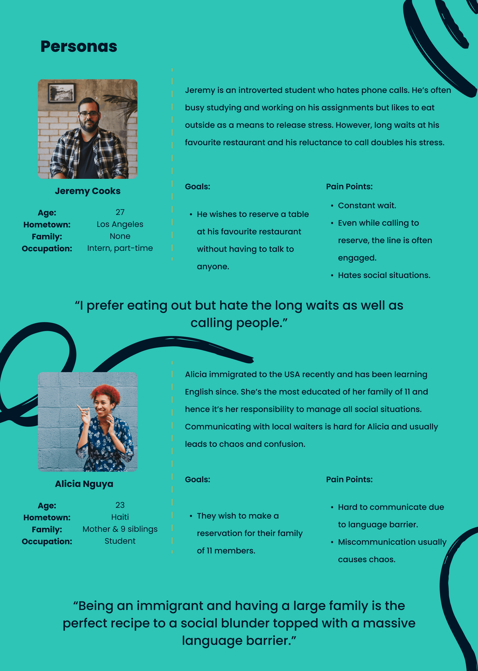
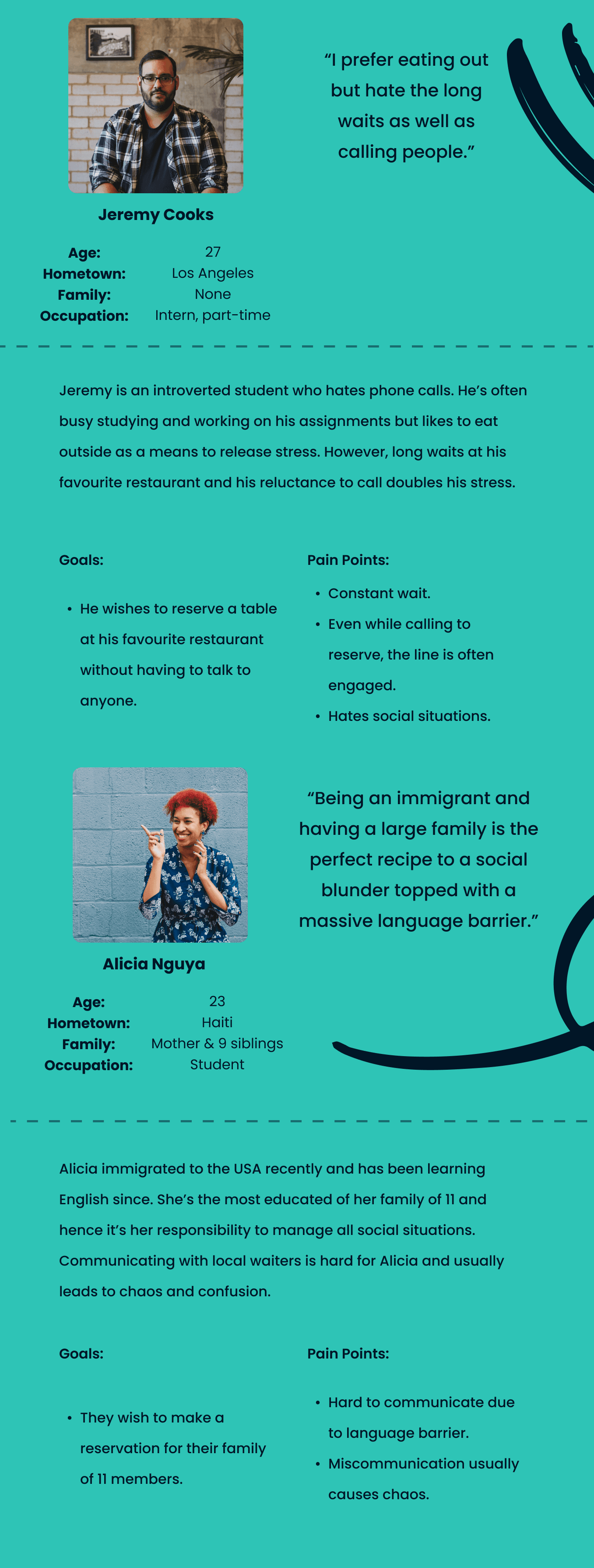
Persona Mapping

User Research & Insights
User Research & Insights
Usability Study - Round 1
Usability Study - Round 1
Usability Study - Round 2
Usability Study - Round 2
Accessibility Considerations
Accessibility Considerations
The Design
The Design
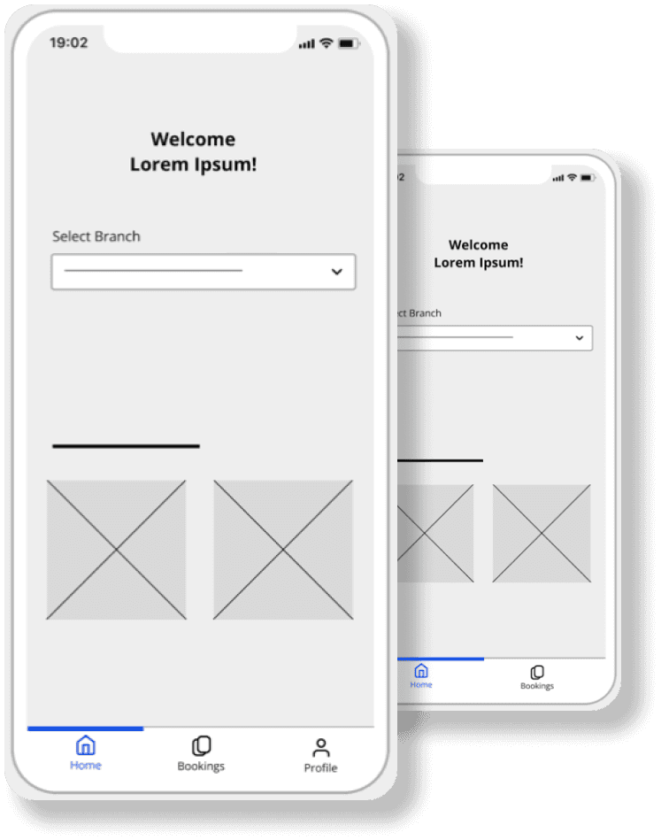
Mockups
Mockups


Primary user research was conducted with friends and family as this project was done during the pandemic. However, I tried to keep the user group as diverse as possible by talking to users from various age groups and backgrounds.
Of the users interviewed, 3 were male college students (19-21 years), 2 female college students (19-21 years), 1 male working professional (52 years) and 1 female working professional (28 years).
Few of the questions asked included:
How often do you dine out?
Have you ever had trouble reserving a table at a restaurant?
What do you find most frustrating about the current process of reserving a table at a restaurant?
Would you prefer using an app to reserve a table instead of calling the restaurant?
Have you ever made a reservation at a restaurant but failed to show up?
Some insights gathered were:
Most users dine out at least once a week.
Some users have had trouble reserving a table at a restaurant, either due to language barriers or laziness to talk to a person.
Some users reported how cancelling reservations was tedious and preferred to simply not turn up at the restaurant.
After and Before testing
The first round of usability studies was conducted on the Low Fidelity designs, and the following insights were found, which were rated out of 5 based on the severity, with 0 meaning that it wasn’t a problem and 5 being a usability catastrophe:
It was observed that 5 out of 5 participants were unable to figure out whether a scrollbar was scrollable. This means that a scrollbar progress indicator is a necessity. [Severity Rating: 5]
It was observed that 2 out of 5 participants felt that phone calls could still get more work done. This means that an additional notes section is required. [Severity Rating: 3]
It was observed that 1 out of 5 participants was confused about whether he already had a booking. This means that an indicator to show the number of bookings would be helpful. [Severity Rating: 3]
It was observed that 2 out of 5 participants felt the congratulations message was slightly lousy. This means that a more direct message would help. [Severity Rating: 1]
It was observed that 1 out of 5 participants felt the empty bookings page looked dull when empty. This means that a message there would help. [Severity Rating: 0]
The second usability study was conducted on the polished prototypes to analyze the design further. The user flow was to reserve a table and then cancel it. The following Key Performance Indicators (KPIs) were used:
Time on task: Time spent on booking a table
User error rates: How often users get stuck on any step
Drop-off rates: How often users give up on their task
Conversion rates: How often do users manage to reserve a table
System usability scale: Questionnaire for follow-up questions
The following were the observed results:
On average, users took 11 seconds to select the restaurant, 18 seconds to go through the reservation screen, and 11 seconds to cancel their booking.
100% of the users could complete the tasks without hassle.
Users liked the design and colors and found the app easy and engaging.
🌐
To help non native english speakers, a translate option is provided in the user profile to make the app accessible to people of all backgrounds.
🙌🏼
All of the navigation and interactive elements are kept towards the lower half of the screen to help users access the app even in one-handed mode be it situational or permanent.
👀
Every time an option is selected, icons not only change colour but also become filled thus aiding those who are visually impaired or cannot see colours.
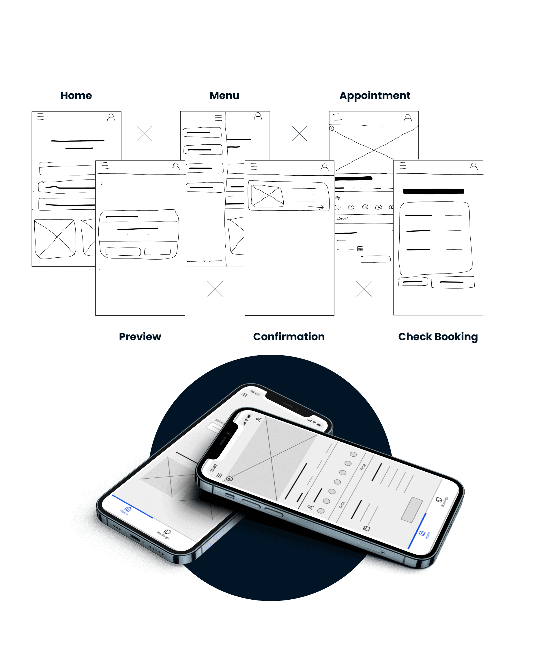
Wireframes
Wireframes
That's the end of this one.
Wanna see another?
That's the end of this one.
Wanna see another?