What is Canvas, and why does it need a redesign?
What is Canvas, and why does it need a redesign?
Canvas is a widely adopted Learning Management System (LMS) used by educational institutions for course management, assignment submission, grading, and communication.
However, despite its broad functionality, users—students, faculty, and staff—have reported frustrations with navigation, customization, and task management. The system can often feel overwhelming and cluttered, which impacts the efficiency and experience of its users.
I first conducted a Heuristic Analysis on various screens using Nielsen's 10 Heuristics for UI Design:


User Research
User Research
Understanding User Needs
Understanding User Needs
To kick off the project, my team and I conducted 5 user interviews and 5 observational interviews each. With a team of 4, we gathered data on 20 users encompassing all the target user groups - students, faculty and staff.
We picked tasks for the observational interviews based on data gathered from the user interviews.
These interviews helped us identify the most commonly used features as well as the key pain points users face in their day-to-day interactions with the platform. Based on the user interviews, we developed the following user personas.
Using the current Canvas app, we used the following metrics to evaluate performance during the observational interviews:
Number of clicks
Time on task
Task completion rates
Using the current Canvas app, we used the following metrics to evaluate performance during the observational interviews:
Number of clicks
Time on task
Task completion rates
Where do the problems arise?
Where do the problems arise?
Students
Creating a To-do list item
Users do not know who to ask for help and end up googling
Sending a message
Retrieving files from courses
Students
Creating a To-do list item
Users do not know who to ask for help and end up googling
Sending a message
Retrieving files from courses
Faculty
Sending a message (TA)
Posting an assignment
Posting a quiz
Faculty
Sending a message (TA)
Posting an assignment
Posting a quiz
Staff
Creating a To-do list item
Sending and Viewing a message
Posting an announcement
Staff
Creating a To-do list item
Sending and Viewing a message
Posting an announcement
So who are we designing for?
So who are we designing
for?

Alex Martinez
👨🦱
Age/Gender
20/Male
🎓
Occupation
Student
📍
Location
Indianapolis
"I just want a clean and simple way to track my assignments without all the clutter."
Goals
Quickly access assignments and grades with less clutter.
Have a more customizable dashboard.
Behaviours
Regularly uses Canvas for assignments, grades, and discussions.
Prefers using mobile apps but is highly proficient with digital platforms.
Struggles with platform clutter but seeks a streamlined experience.
Frustrations
Finds the "To-Do" list cluttered with unnecessary posts and announcements.
Confused by inconsistent terminology between "Modules" and "Assignments."
Design and Iteration
Design and Iteration
Moving ahead, we decided to focus on the student persona for the redesign due to the large sample of users available to us.
Moving ahead, we decided to focus on the student persona for the redesign due to the large sample of users available to us.
Low Fidelity Wireframes

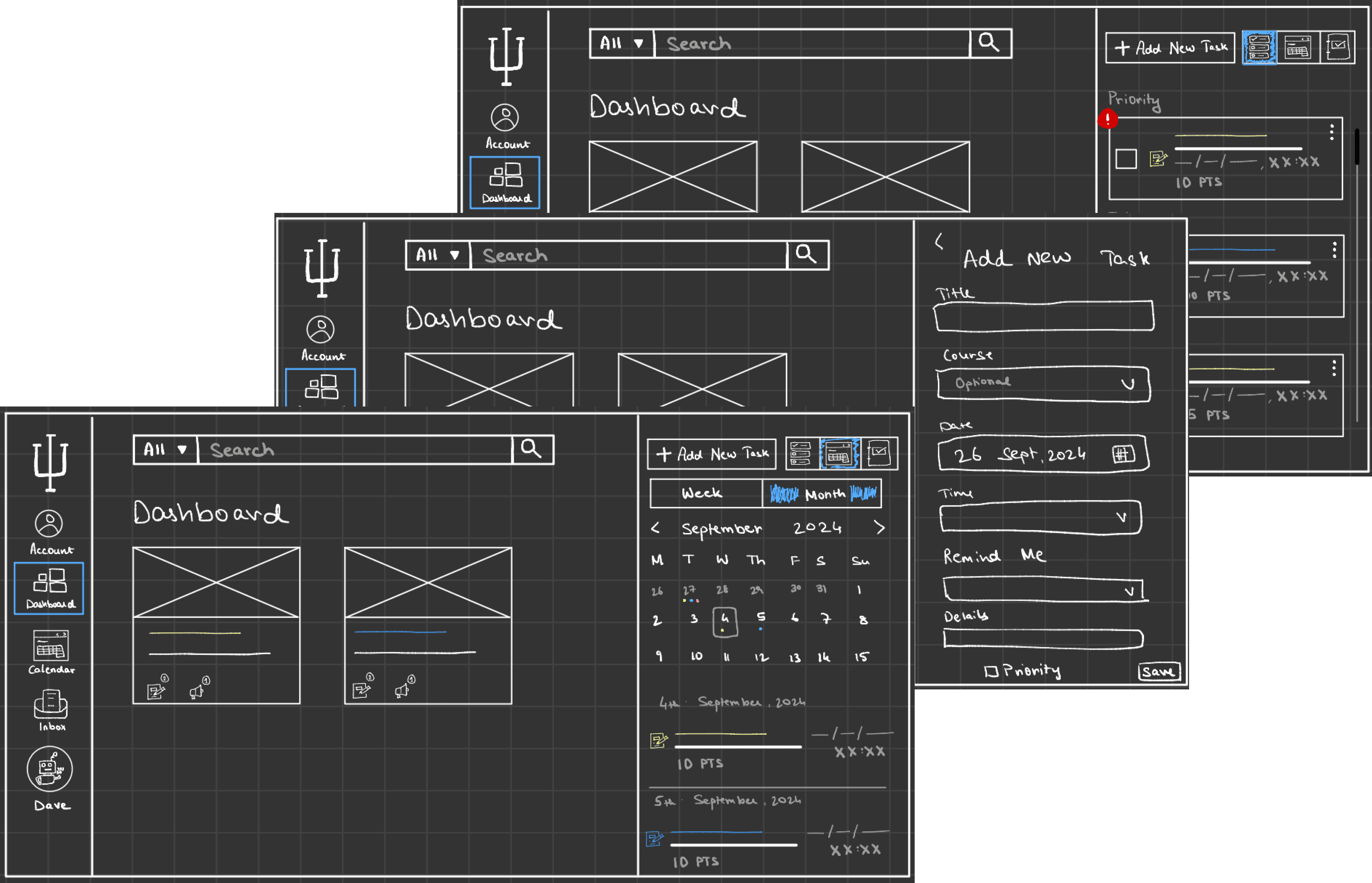
While testing the low fidelity wireframes, we saw that most users were confused about the placement and function of the search bar at the top in all pages as they were used to seeing it in the files section only. Hence, we decided to go with redesigning the Help section instead.
While testing the low fidelity wireframes, we saw that most users were confused about the placement and function of the search bar at the top in all pages as they were used to seeing it in the files section only. Hence, we decided to go with redesigning the Help section instead.
Mid Fidelity Wireframes

High Fi Designs

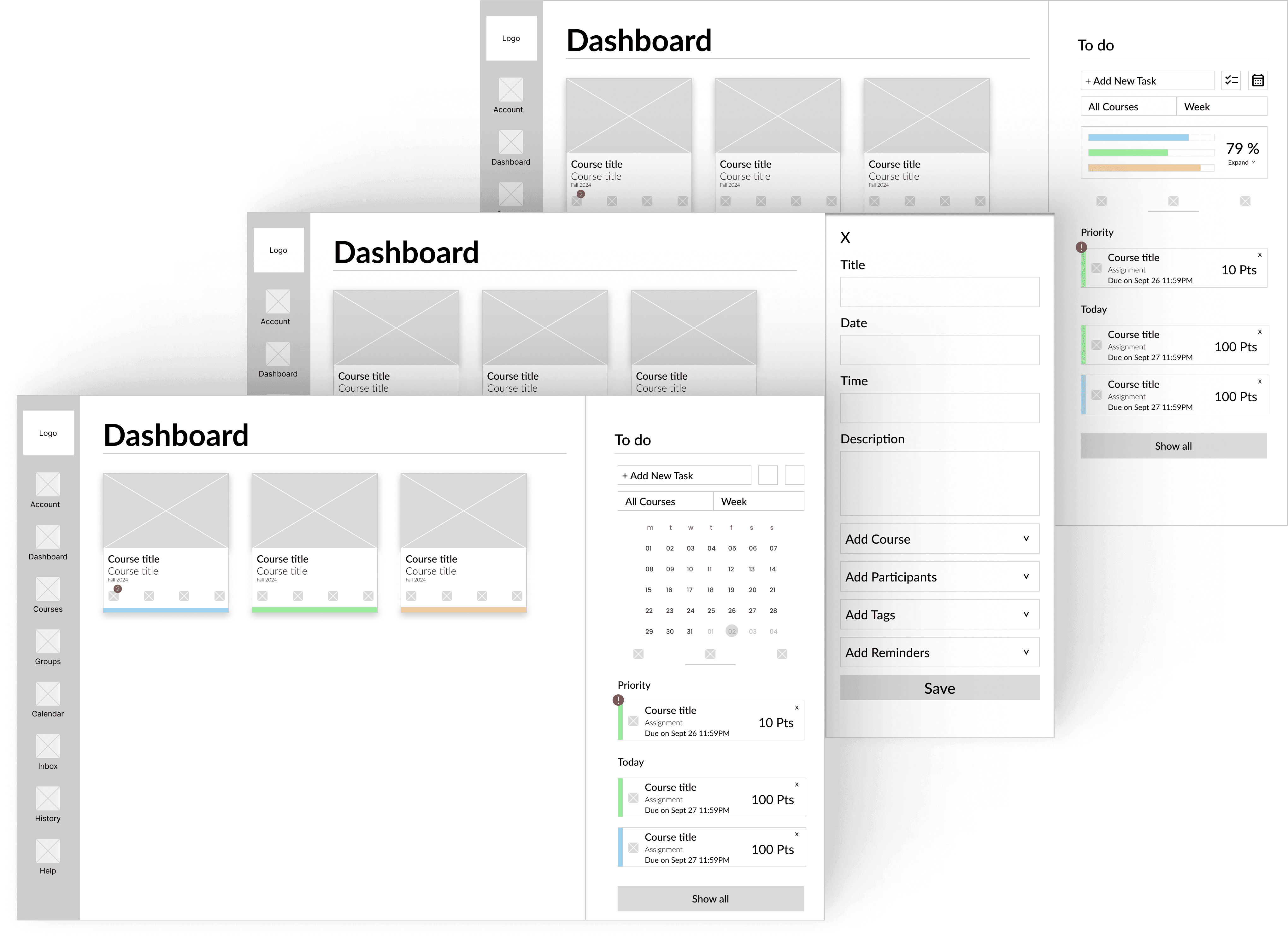
Creating a new to-do item
The Add Task button is now a prominent CTA that is easily findable by the users.
Users can see their overall remaining work at a glance or filter by course with a single click.
Group collaboration is enhanced as users can assign tasks to group members directly from the to-do list.
A mini calendar is embedded in the to-do list, enabling users to plan their days more efficiently.
Users can prioritize tasks, ensuring that important tasks always appear at the top.
Task: Creating a new to-do item
The add task button is now a prominent CTA that is easily findable by the users.
Users can see their overall remaining work at a glance or filter by course with a single click.
Users can also add their group members to a to-do item making it easier to plan group tasks.
A mini calendar is integrated in the to-do list that allows users to plan their days better.
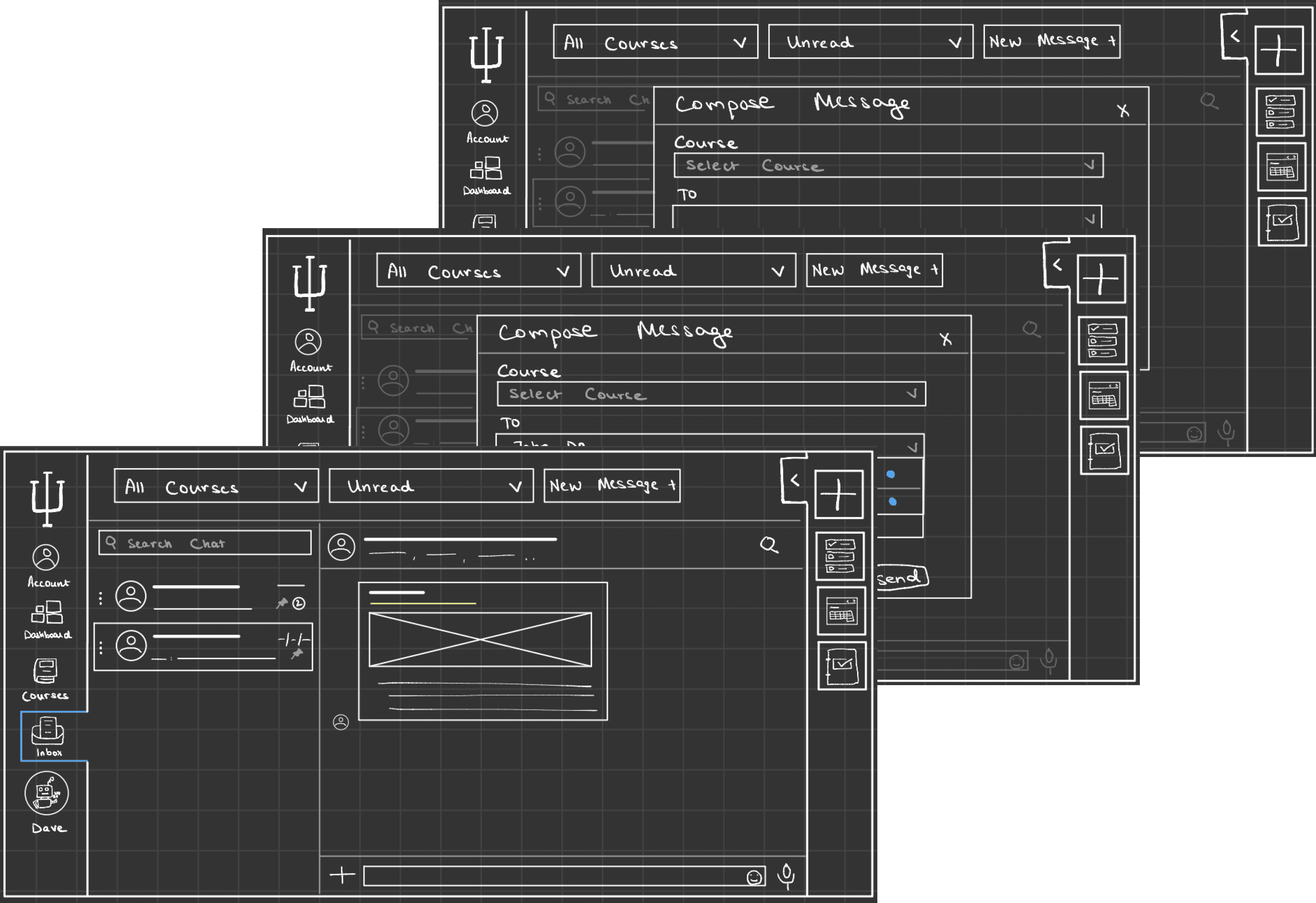
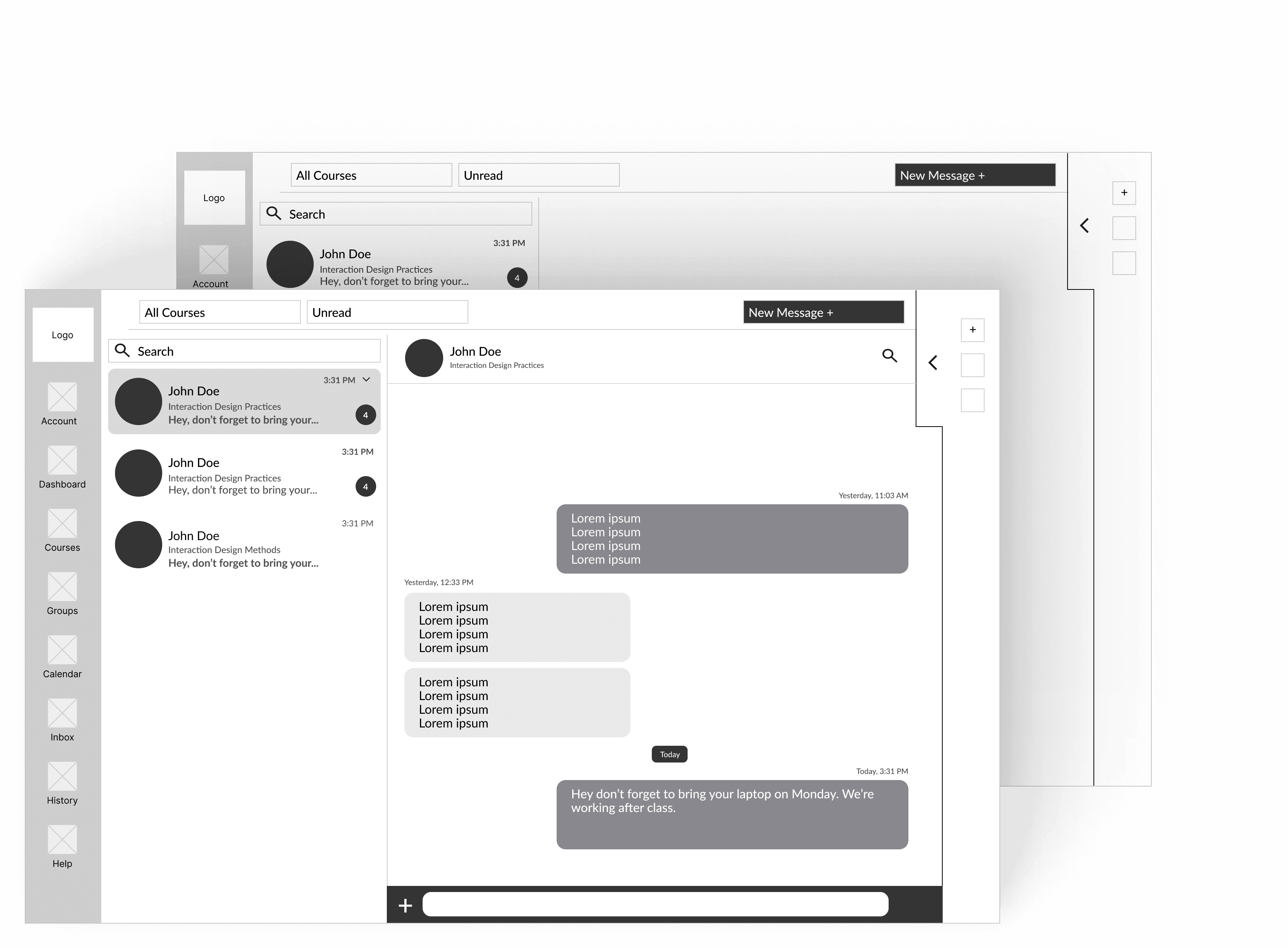
Sending a message via Inbox
The Compose Message function is now a clearly visible CTA, improving accessibility for users.
The inbox interface mirrors a professional messaging app, ensuring that conversations are seamless and organized.
Users can easily create Group Tasks for their Canvas groups with just a few clicks.
Even with multiple threads for the same user (based on course or subject), shared files are accessible across all versions of the conversation, making file management easier.
Task: Sending a message via Inbox
The compose message is now more prominent and a CTA that is easily visible to the user.
The inbox style takes on a professional messaging app approach keeping chats seamless and professional.
Users can quickly create "Group Tasks" for their Canvas groups with a few clicks.
While users can multiple threads with the same user based on course and subject, all files shared are accessible from any version of the chat.


Seeking help
We noticed users preferred discovering features on their own and only referred to tutorials when necessary.
To support this, the Help section was redesigned to include tutorial playlists and FAQs, offering quick solutions for common queries.
For more complex issues, users can search forums, contact their instructor, or send feedback directly to the university.
User Testing and Impact
User Testing and Impact
We tested each each stage of the wireframes with at least 8 users, gathering feedback at each stage and iterating before we move ahead.
With the final designs, we witnessed considerable improvements with regards to the Key Performance Indicators. Due to a lack of a comprehensive Help section in the current version of Canvas, we do not have improvement metrics for the same, however, users pleasantly welcomed its addition.
86%
86%
decrease in time taken for creating a to-do task
decrease in time taken for creating a to-do task
117%
117%
increase in completion rate for creating a to-do task
increase in completion rate for creating a to-do task
68%
68%
decrease in time taken for sending a message via inbox
decrease in time taken for sending a message via inbox
Time on Task (seconds) plotted for each version of the prototype
Challenges and Learnings
Challenges and Learnings
Due to their busy schedules, it was quite challenging to schedule interviews and collect data from faculty and staff. We reached out to 50+ faculty from institutes across the United States that used Canvas.
For additional data, we used surveys that were circulated throughout the duration of the study which provided us with important insights such as students struggling to coordinate events with their group mates.
Throughout our interviews, my teammates and I shadowed each others' sessions by acting as note takers. this allowed the primary interviewer give 100% of their attention to the user and their behaviour.
That's the end of this one.
Wanna see another?
That's the end of this one.
Wanna see another?